
Services — Packaging Design
Services — Packaging Design
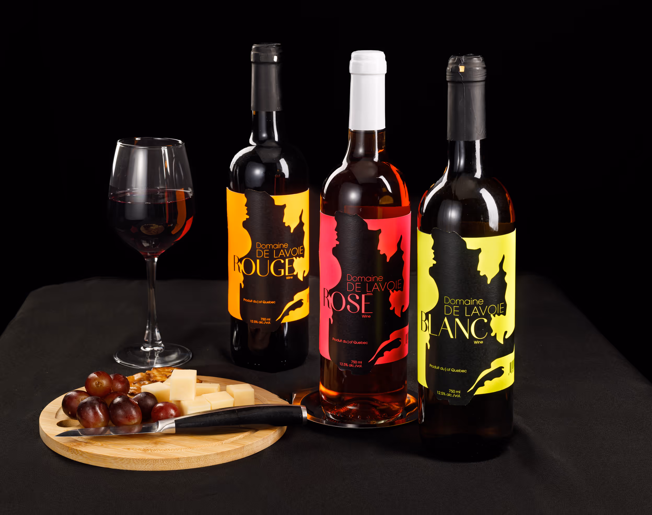
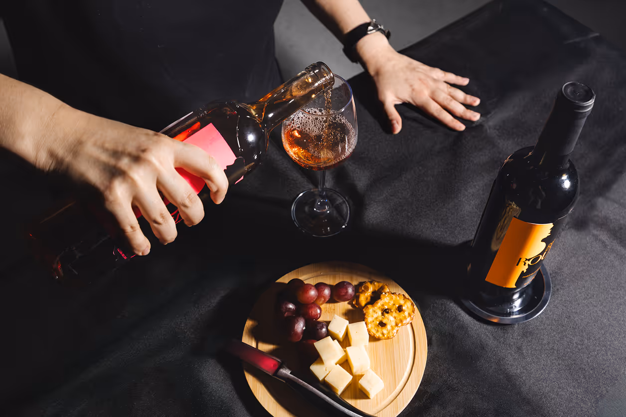
Developing a wine packaging line for Marchés Publics de Montreal — a network of public markets that bring Montrealers closer to local producers, market gardeners, retailers, restaurateurs and agri-food artisans.
The packaging should be inspired by the concept of “Terroir”— a distinctive character of ingredients shaped by geography, climate and culture.
The goal was to create a label that would feel modern and approachable, rather than extremely high end and classy. The initial concept consisted of using a transparent label, imitating a glass print. However it ended up evoking issues with legibility. That led into a consideration of a second concept, that was about referencing the local organic production of the wine within Quebec through its map being a primary graphic.
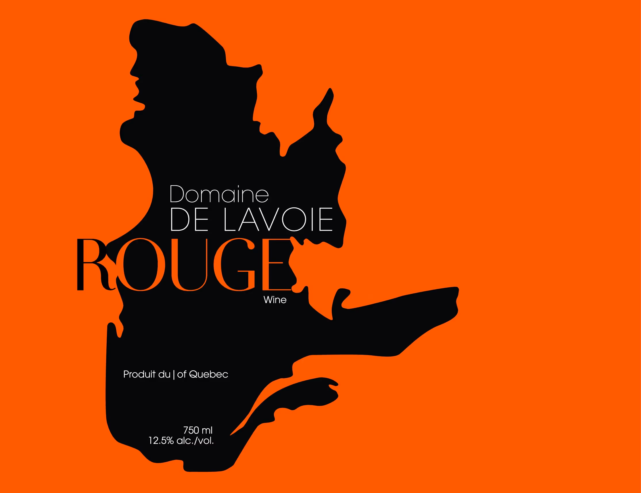
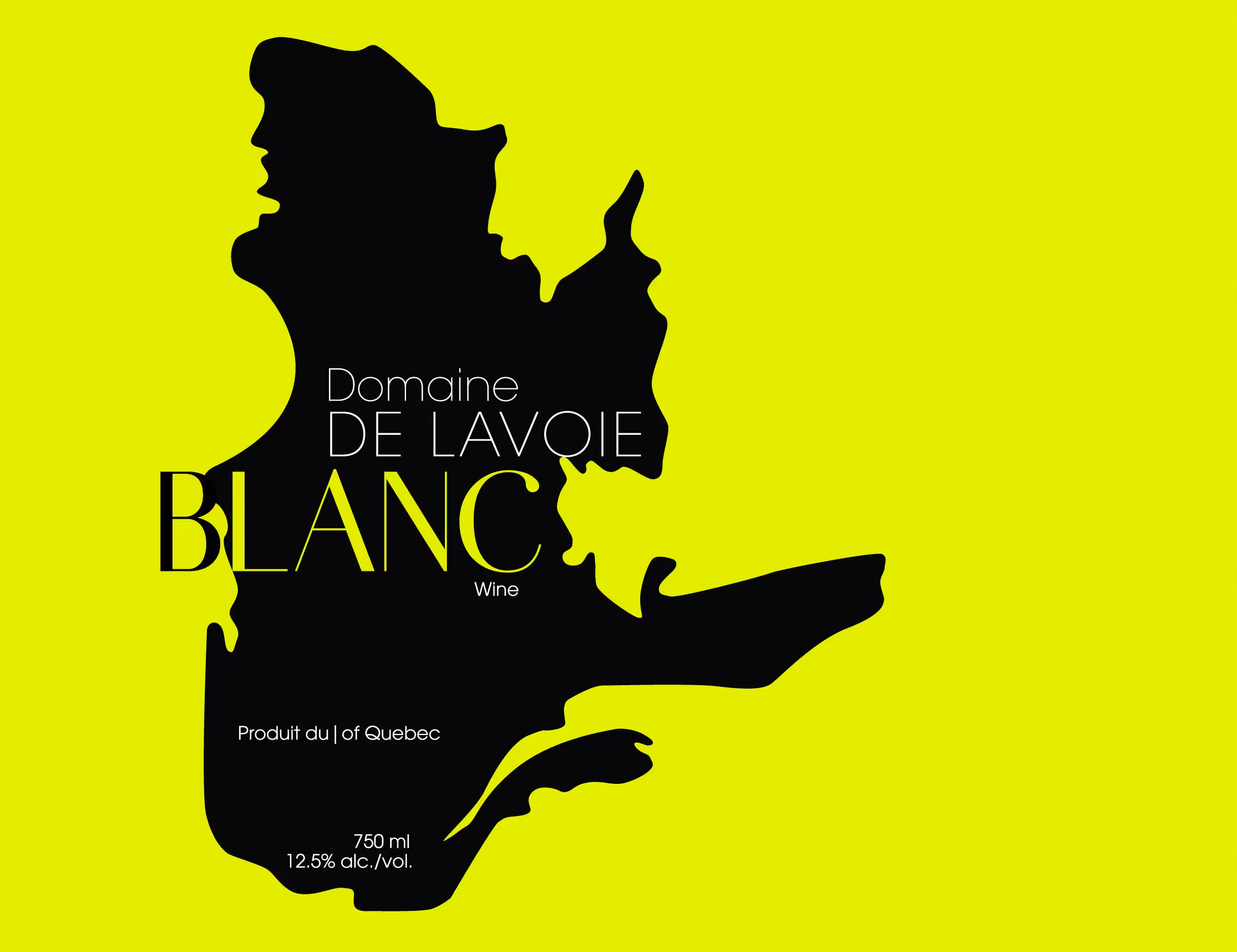
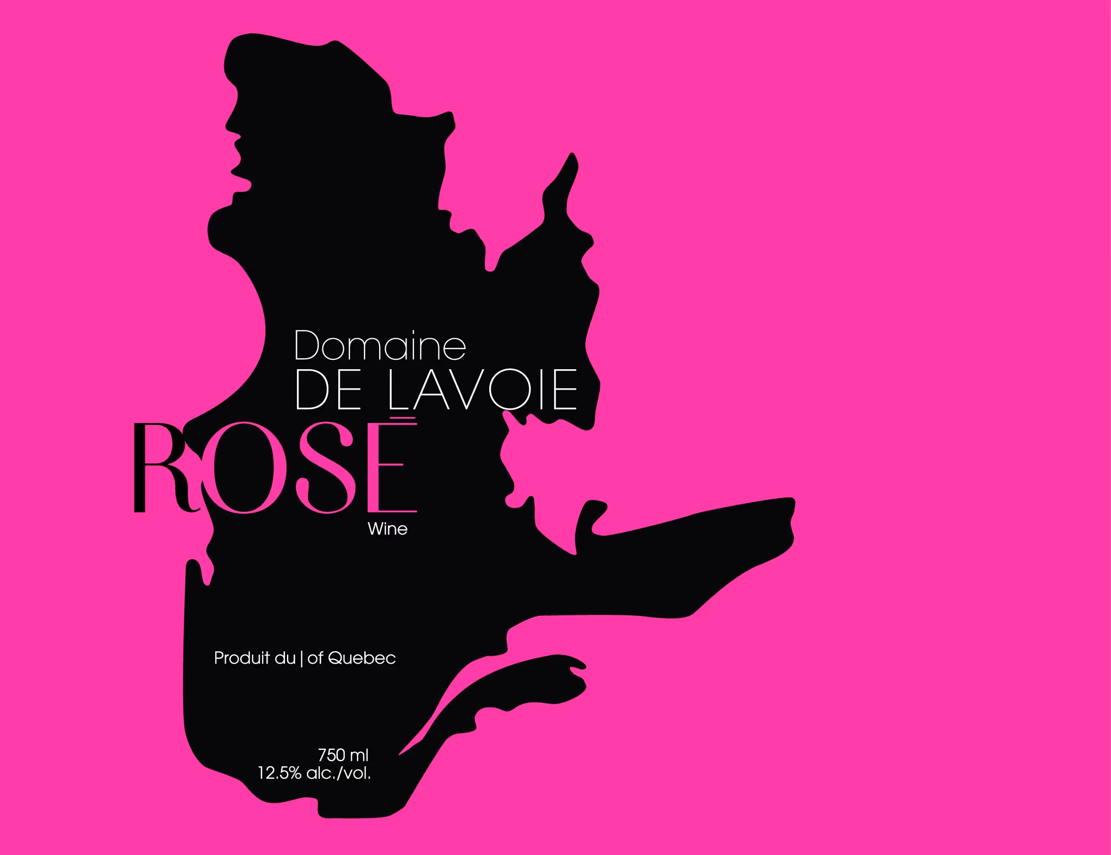
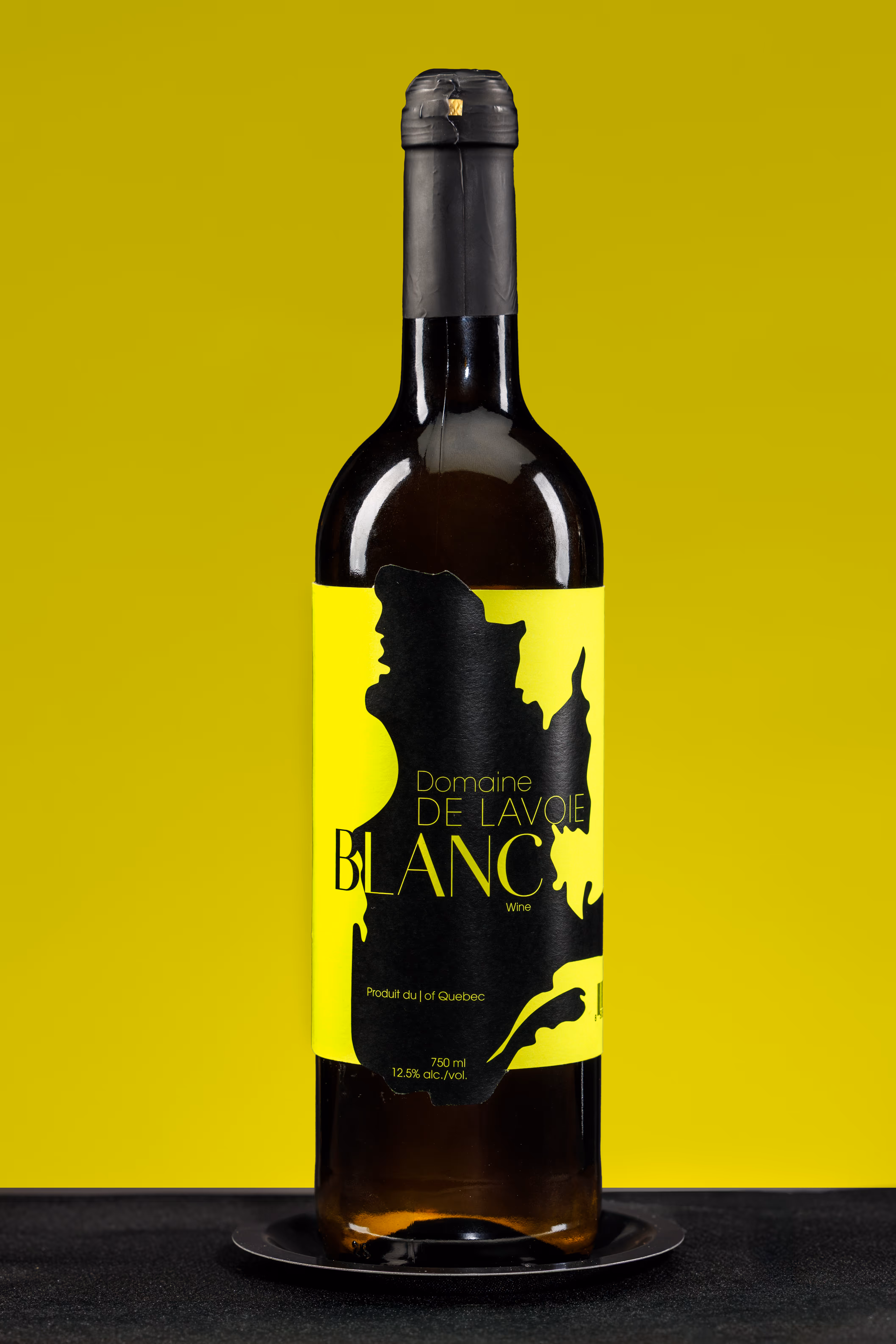
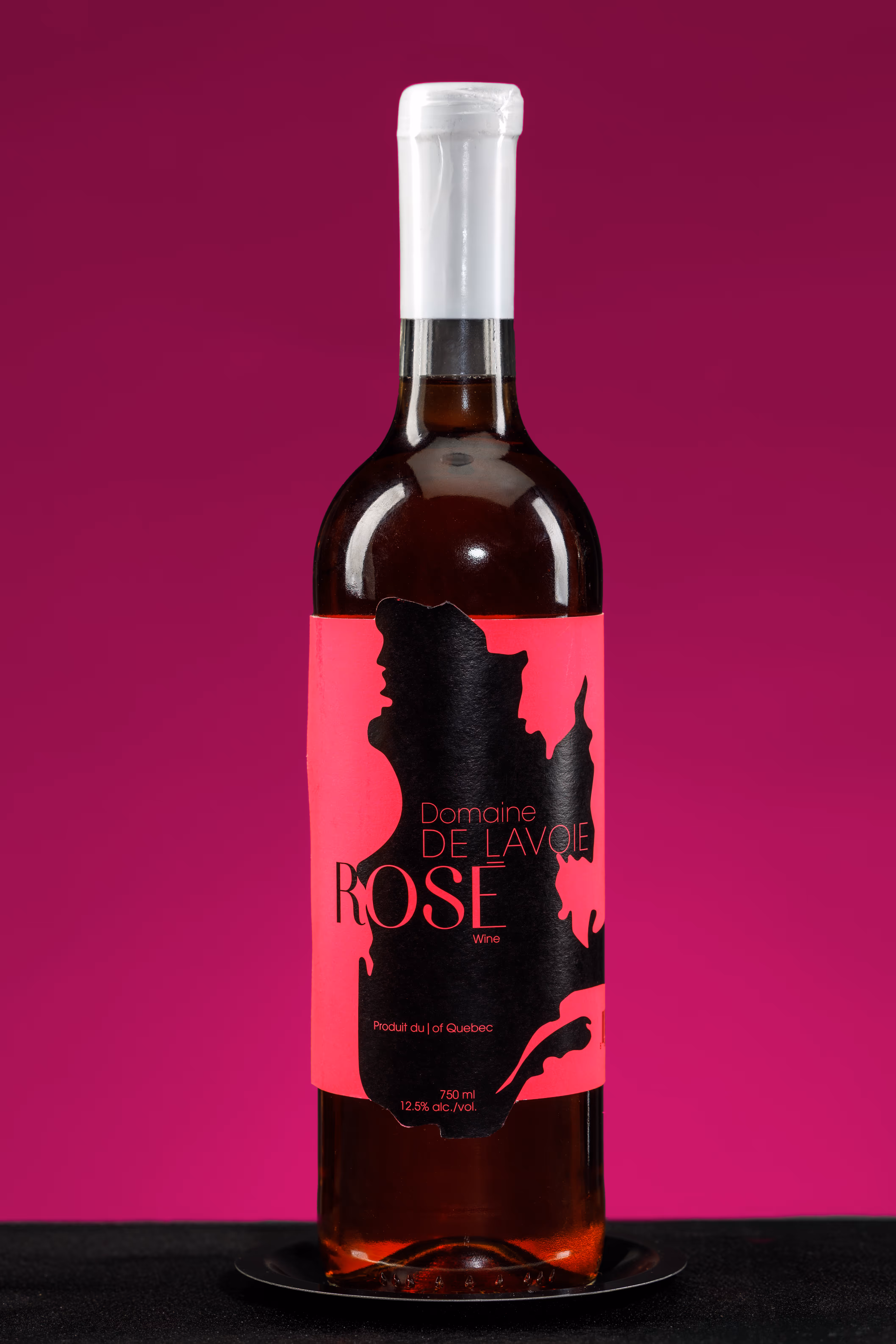
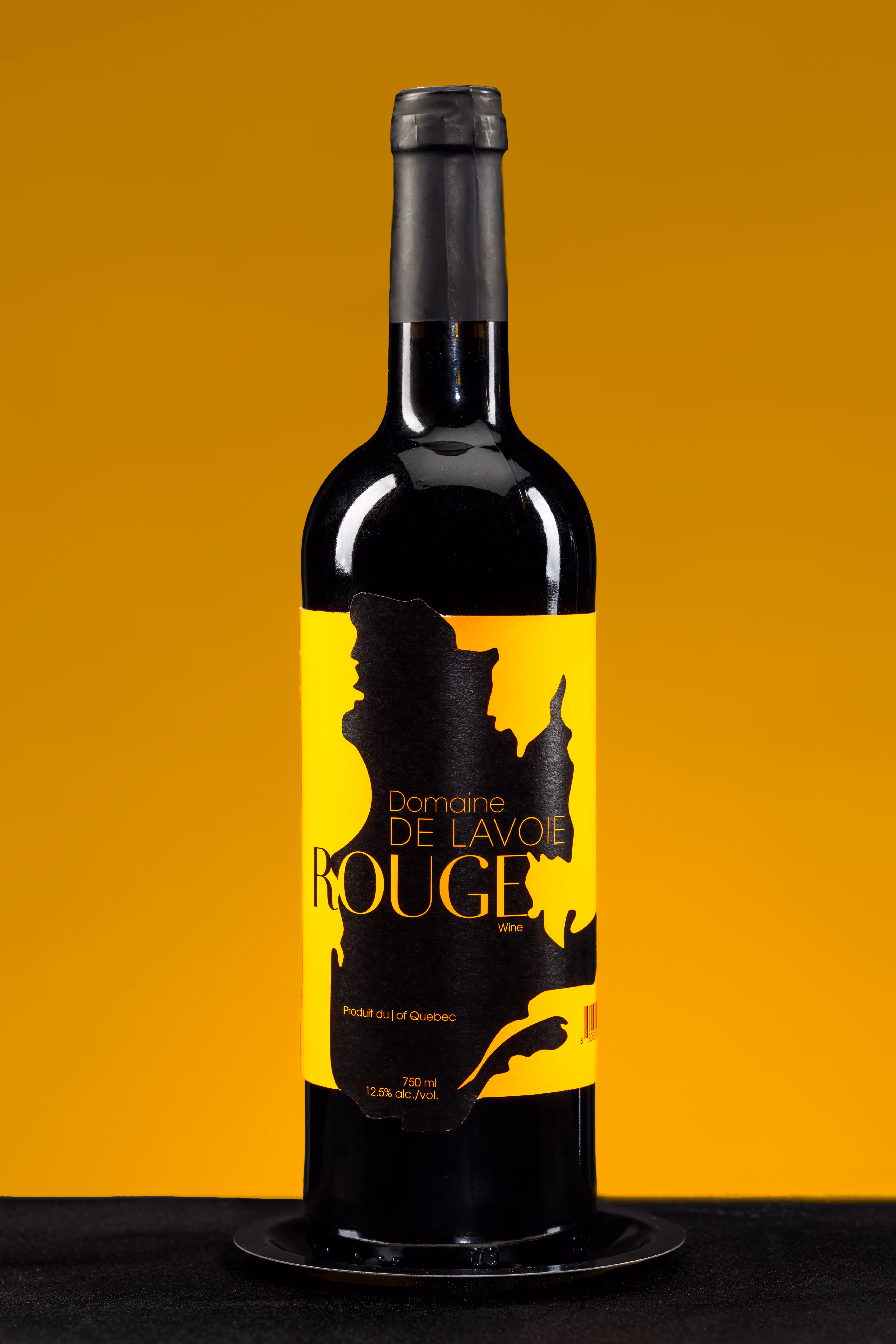
The packaging consists of three distinct labels — red, white and rosé. The labels reflect local identity and organic production of the wine through the distinctive silhouette of the Quebec map as the main graphic. The labels use balance between serif and sans serif typography, maintaining a high end feel while keeping the bottles modern and visually appealing. The choice of fluorescent paper, matching the colour of wine, further helped to elevate the design, making the labels strongly distinctive.
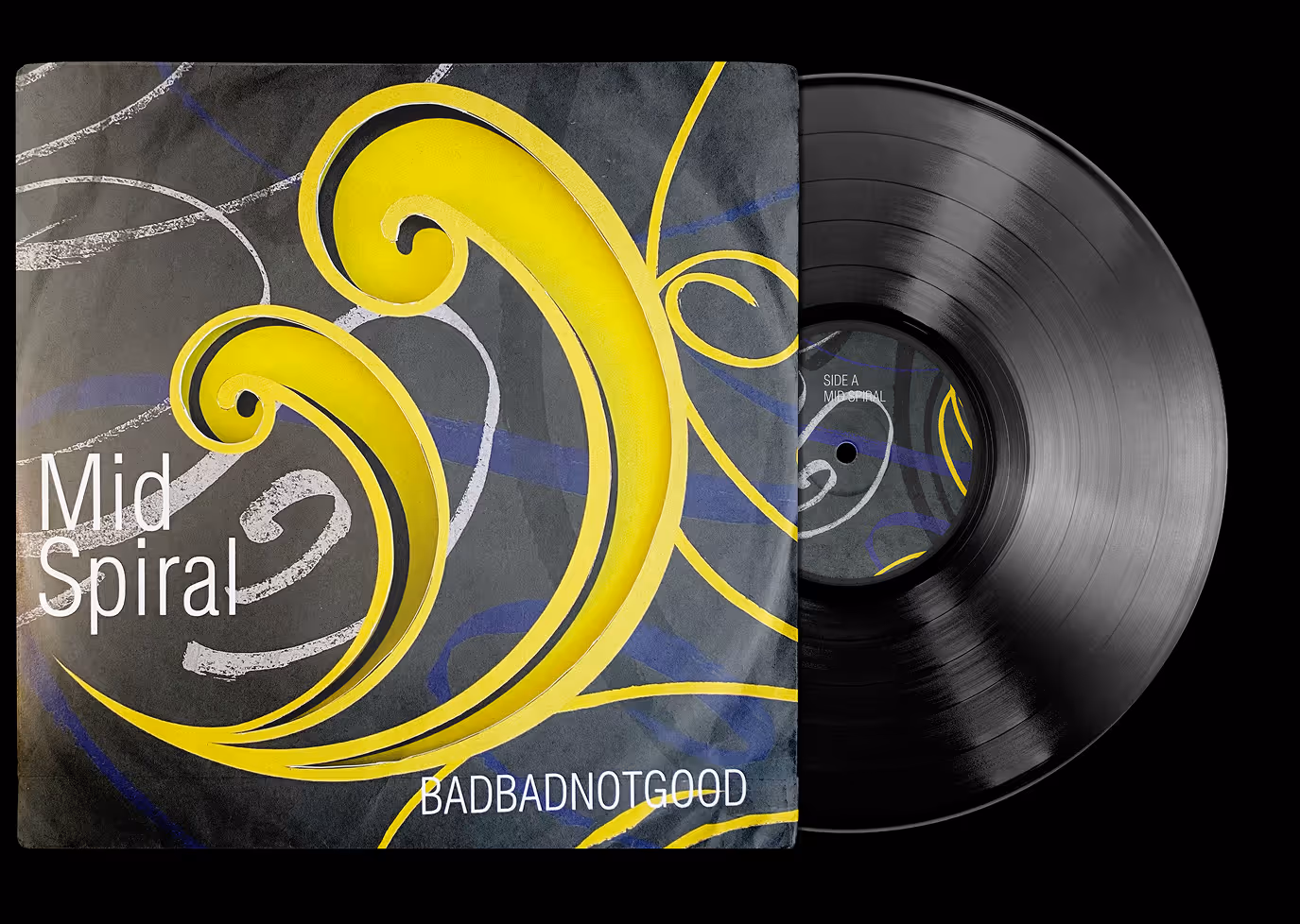
Mid Spiral 7’’ Vinyl — Record Sleeve
Packaging Design
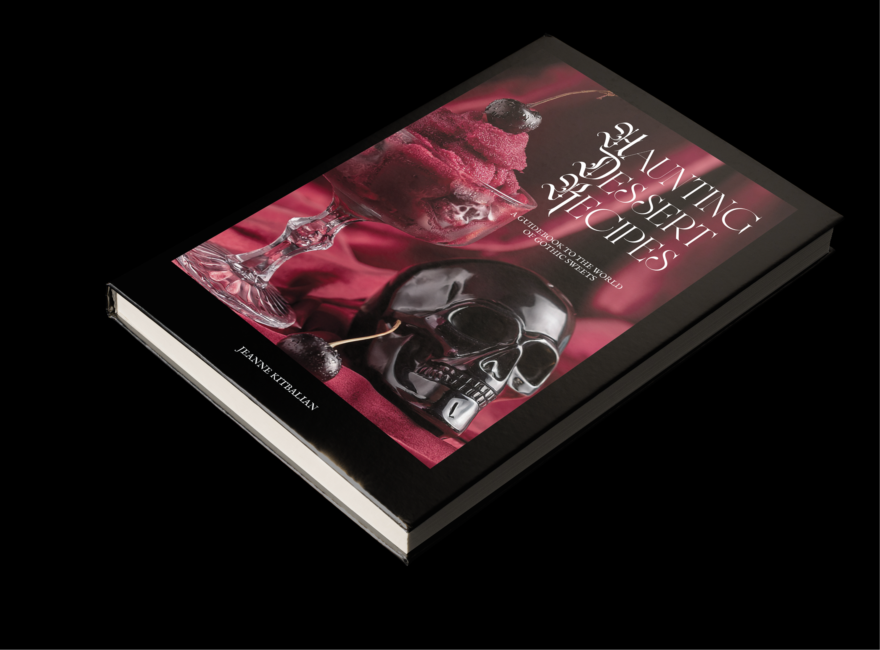
Haunting Dessert Recipes — Cookbook
Editorial Design
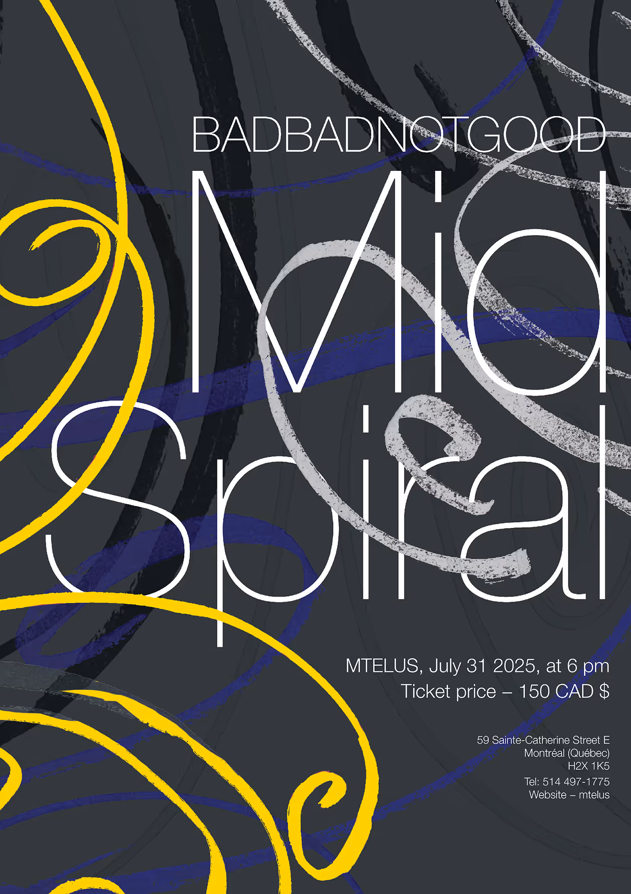
Mid Spiral — Music Poster
Promotional Design
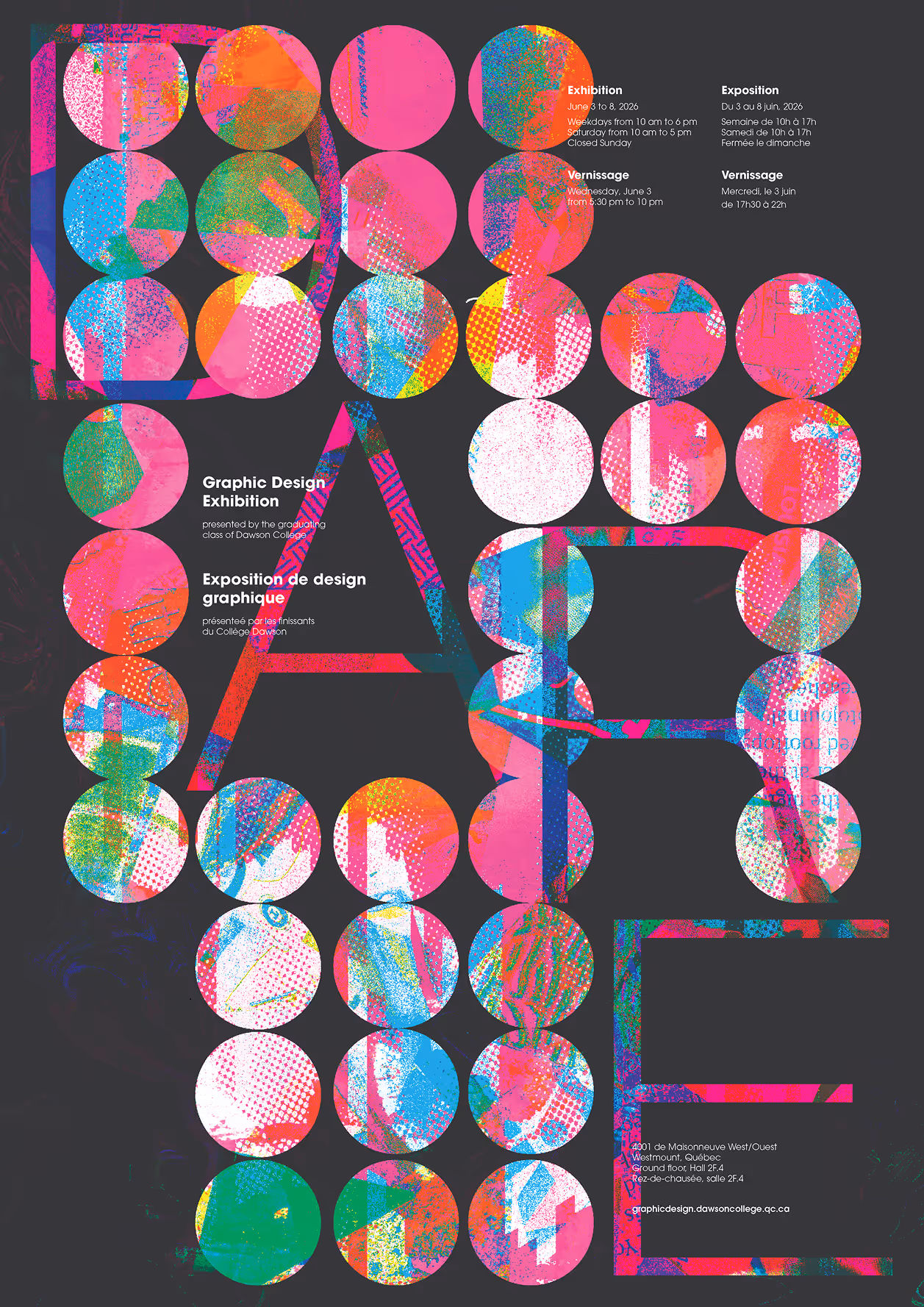
DARE — Dawson Exhibition Poster
Packaging Design